No. 69 — Show Your Papers
It’s November 9, 2023, and you’re reading the newsletter from Médianes.
Hello there,
Do you pay attention to your senses when you turn the pages of a newspaper, a magazine, or a book? For me, paper was long nothing more than a practical material. It was while looking at the issues of *La Revue écossaise*, *Pays*, and *La Déferlante* on my bookshelves that I realized each of these magazines used a different kind of paper, and that this choice helped express their editorial identity.
Beyond the printed words, paper speaks to the senses. It can envelop you in softness, send shivers down your spine, and evoke memories of a bygone era. Weight, texture, ink, appearance: we’ll take you on a journey into the unknown world of paper selection, guided by the advice of three art directors.
Also in this issue: an overview of the use of artificial intelligence in the media, a language in decline, glaciers, and job listings, of course.
Enjoy the read,
— MARINE SLAVITCH, JOURNALIST AT MÉDIANES
Why not?
IDEAS FOR YOUR MEDIA
The best paper isn't necessarily the most expensive or the highest quality. It's the one that best reflects the story your project tells. So how can you be sure you're making the right choices? The best thing to do is to trust your instincts.
Touch
The feel of the paper is an extension of the content. You might choose a velvety texture to convey a sense of softness, a grainy texture to evoke a more raw material, a smooth texture to highlight photos, or a rough texture to enhance the impact of the words. From paper weight to texture, our art director, Christelle Perrin, takes you on a journey through these sensory experiences to help you understand the implications of these choices.
Listen
Reading a newspaper is also punctuated by the rustling sound of the pages as they turn. Do we want that sound to be crisp or soothing? To find that perfect match, the founding team at 1 hebdo tested several types of paper with varying textures and weights. This experiment gave rise to a newspaper that invites its readers each week to “unfold” the news. To learn more, check out our interview with Natalie Tiriez, Artistic Director of 1 hebdo.
See
Paper is a powerful tool for reinforcing the visual message. It can give images a special vibrancy, make illustrations stand out, or contribute to the overall visual atmosphere of the publication. Censored magazine likes to experiment with paper to create original covers that always reflect the issue’s theme. It’s also an excellent way to catch the eye in bookstores, explains Apolline Labrosse, Art Director at Censored.
Want to learn more? Check out our series on choosing paper on our website.
From the studio's perspective
PROJECT SPOTLIGHT
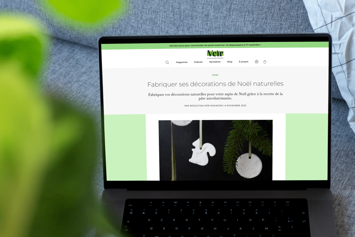
Over the past few months, we've been working with the team at Veìr magazine on the redesign of their website, which went live a few days ago!
Veìr is an independent quarterly print magazine dedicated to gardening, plants, and nature, aimed at new gardeners. The goal of this redesign was to make the website more visually appealing and clearer, and to streamline the subscription and purchase process.
The project involved redesigning the visual identity by proposing new fonts and colors, designing the website mockups, and then implementing and configuring them. Check out this case study on the studio’s website.
MÉDIANES, THE STUDIO / CHRISTELLE PERRIN / VEÌR
On Our Radar
OUR MARKET RESEARCH TO SUPPORT YOUR PROJECTS
Rethinking Your Value Proposition
BRIAN VESELING / WAN-IFRA
The introduction of a single subscription plan for access to all content, the development of a catalog of high-quality podcasts, and the use of internal planning tools… The transformation of the Danish daily newspaper *Politiken* has enabled it to double its digital revenue.
That's it, period
C. BENZITOUN, A.-C. SIMON, AND P. GYGAX / THE CONVERSATION
The Senate has just passed a bill aimed at “protecting the French language from the excesses of inclusive writing.” To get some perspective, we recommend this article, which we found in a very comprehensive thread by linguist Laélia Véron. “The standard should not be imposed in a stifling manner,” the article states.
Over at medianes.org
IT'S HOMEMADE
Overview: The Use of AI in the Media
OWEN HUCHON / MEDIANES.ORG
The democratization of artificial intelligence through the use of tools like ChatGPT has prompted a reaction from the media. How can we make the most of this new array of tools without compromising the quality of information? Format, approach, debates, tools: an overview of their uses.
In Brief
THAT WAY, YOU'LL KNOW
• La Lettre, Ouest-France, Mediacités: These media outlets are hiring. Check out their job openings.
• The travel and exploration magazine *Reliefs* is dedicating its latest issue to glaciers.
• The Association of Anti-Racist and People of Color Journalists is launching a media criticism newsletter.
• Leica is releasing the M11-P, a new camera that stores metadata that can be used to verify the authenticity of an image.
• To dive into the wild history of the paperback, we recommend *Little Blue Books* by Goulven Le Brech. We’ve read it and approve.
See you on November 23!
We’d like to take this opportunity to welcome the teams at Kikina, Jeune Afrique, and Reporterre, as well as everyone who has recently subscribed to this newsletter.
Did you like our Top 50 newsletters? You'll love the one on magazines that we're currently putting together. If you have any favorites to recommend, feel free to leave us a message.
We’ll see you on November 23 for the next issue of this newsletter. It’ll be a holiday special—because it’s tiiiiiiiiiime! Until then, take care of yourselves and your social media.
— THIS NEWSLETTER WAS PREPARED BY MARINE SLAVITCH AND MARINE DOUX WITH THE MÉDIANES TEAM.
MEDIANES.ORG — MEDIANES.STUDIO
Médianes is on Instagram, Twitter, and LinkedIn.