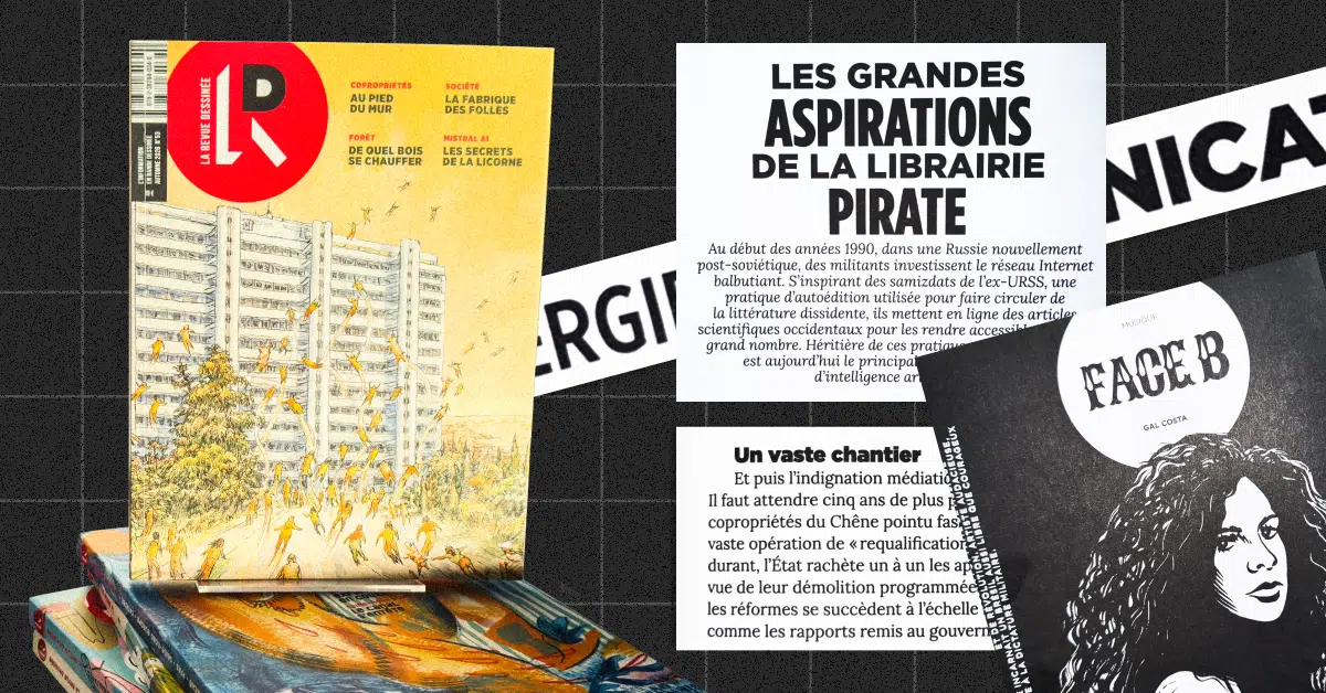
This article marks the launch of the new “Let’s Talk Design” series. Christelle Perrin, design director at [name]Médianes, meets with other media art directors to discuss creative projects, reorganization, or visual redesigns, with the aim of showing how design can help clarify a media outlet’s positioning or illustrate an evolution in its editorial direction.
This article is based on a transcript of remarks made by Cat Gabillon, artistic director of *La Revue Dessinée*.
There’s a lot of talk about major redesigns, but rarely about minor ones. Yet these “facelifts”—which tweak a visual identity without starting from scratch—are often more delicate: it’s all about striking the right balance to refresh without disrupting, and no one comes to congratulate you on changes that go largely unnoticed. I believe it’s essential to take the pressure off visual redesigns so that, over time, a brand’s visual identity can evolve more naturally alongside the editorial project.
Two years after Casterman acquired *La Revue Dessinée*—a publication that has been publishing investigative reports and in-depth articles in comic book form since 2013— the idea for the redesign stemmed from proposals by Baptiste Bouthier and Alexia Eychenne, the editors-in-chief, followed by a planning and brainstorming session organized by Cat Gabillon to gather the wishes, frustrations, and thoughts of the entire team, so that they could collectively shape the redesign.
The desire to revamp a publication often stems from the team’s weariness; they may feel like they’re doing the same things over and over again. Of course, this doesn’t necessarily mean that the audience is getting tired of it too, and it’s important to distinguish between the two. Cat believes, however, that if the people behind the magazine aren’t having as much fun, it eventually shows. But committing to changing the layout isn’t easy, and it took La Revue Dessinée six months to get this much-talked-about revamp off the ground.
Cat Gabillon, art director of *La Revue Dessinée*, and Valentine Dossat, layout artist, had no intention of reinventing everything. Cat wanted to respect what the original artistic director, Elhadi Yazi, had established and maintain continuity without disrupting the readers’ habits too much, since the publication isn’t drastically changing its editorial identity. The goal is rather to highlight small changes, to enhance the magazine’s presentation, and to showcase its current positioning.
“A facelift is anything but a free cosmetic makeover. It reflects a strategy, an evolution. The best facelifts are the ones where you realize something has changed, but you can’t quite put your finger on what it is.”
Keep what doesn't need to be changed
The format and paper were still suitable. After discussion, the team decided not to make any changes in that regard. This also helps avoid a too-abrupt break in the series: both the spine thickness and the magazine’s dimensions remain the same. We could have considered taking this opportunity to try to reduce paper costs, but it didn’t seem right to compromise the magazine’s physical quality.
Expand the readership
This redesign also comes amid a crisis in the paper, publishing, and bookstore industries, as well as information fatigue: there are many reasons to avoid change and wait for a better time. When you feel the time is right, it sometimes takes a little courage to take the plunge.
With this complicated context in mind, the idea was to reorient the magazine toward a broader audience in order to reach both people who love illustration and those who prefer in-depth articles.
One of the factors was to vary the formats and topics so as to be less like “that little left-wing magazine with cartoons.” To achieve this, the layout—that is, the structure—was redesigned to ensure that the magazine’s pace is neither too dull nor too fast-paced. This allows us to ensure that there is a balance between in-depth features and shorter pieces to dip into.
Their goal was to place a little more emphasis on serious journalism in order to break away from the image of a magazine aimed exclusively at comic book readers.
Making the journal more accessible
The challenge was also to strike a balance between creativity and credibility: to be a magazine that offers a wealth of artistic ideas in terms of form, without ever losing sight of the journalistic integrity of its content.
"I think there are a lot of people who, when they see the cover, think to themselves, 'This is a really important topic, and it's a beautiful book,' and that intimidates them."
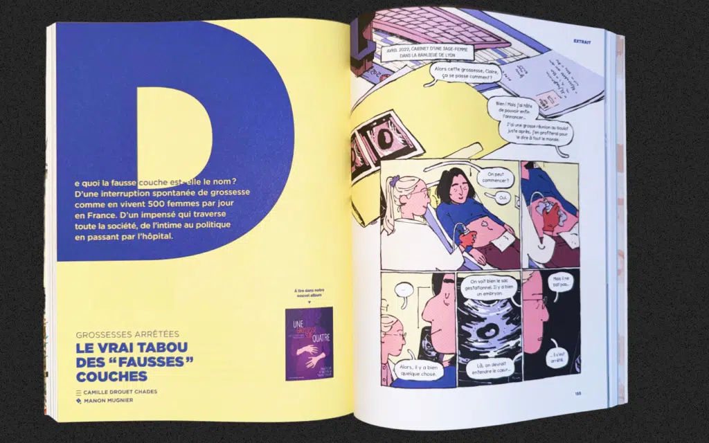
To further anchor the magazine in journalism, the decision was also made to add a serif font—something that had never been used in the magazine before and is very rare in the world of comics. This font is reserved for blocks of text. It lends a more literary feel, a certain seriousness. It has another feature that’s very useful for journalistic layout: it can be set densely in text columns, just like in a newspaper, which creates a sharp contrast with the comic book pages, where the text is written in a rounder, more fluid style.
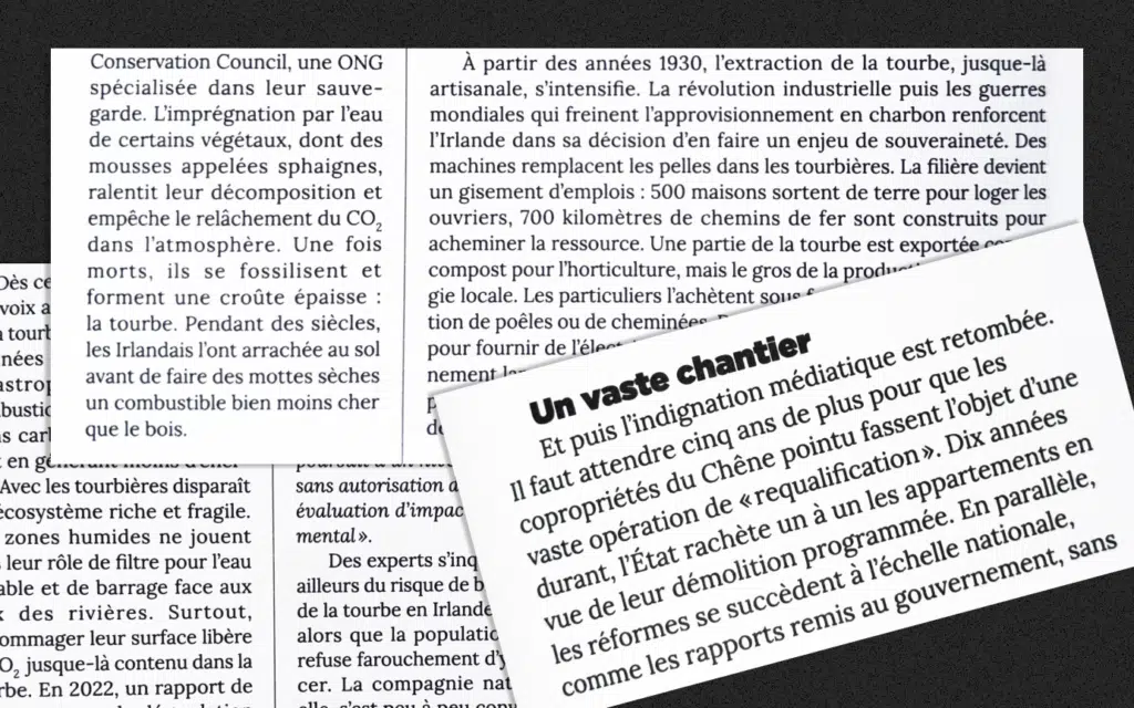
To make the journal resemble a magazine, the barcode was placed on the cover, right next to the logo, since barcodes are part of a common, everyday commercial world. This helps standardize the journal and distance it from an overly artistic realm, while also indicating that it is not a comic book.
Cat told me that when she was in school, she was fascinated by Raymond Loewy, a Franco-American industrial designer from the mid-20th century who helped popularize the idea that an object doesn’t just serve a basic function, but can also be visually appealing to a wide audience. She believes that in media design, we also seek to speak to as many people as possible in an aesthetically pleasing way, without compromising the integrity of journalism. When we present a printed item, everything factors into our perception: its thickness, the texture of the paper, and the appearance of what’s printed on it. We create items that will exist in people’s hands and homes.
The magazine is well-established and no longer has to prove itself
When starting a project, it’s important to clearly explain (including visually!) what kind of media outlet we are and what we offer. It’s certainly helpful to have a catchy slogan and a distinctive, memorable, and vibrant artistic direction—which is exactly what Elhadi Yazi, who designed the initial artistic direction in 2013, proposed.
Then, an initial redesign in 2017 made the text more readable and the structure more organized, but perhaps took a somewhat overly rigid approach. The goal of this second redesign was also to strike a balance between the two.
The logo used to take up a lot of space on the cover. Now, the focus is on the monogram formed by the intertwined letters R and D, while the title “La Revue Dessinée” is more discreet, appearing vertically. As for the slogan “News in Comics,” it has been moved to the margin, since there is less need to keep hammering it home. This leaves more space for the cover illustration.
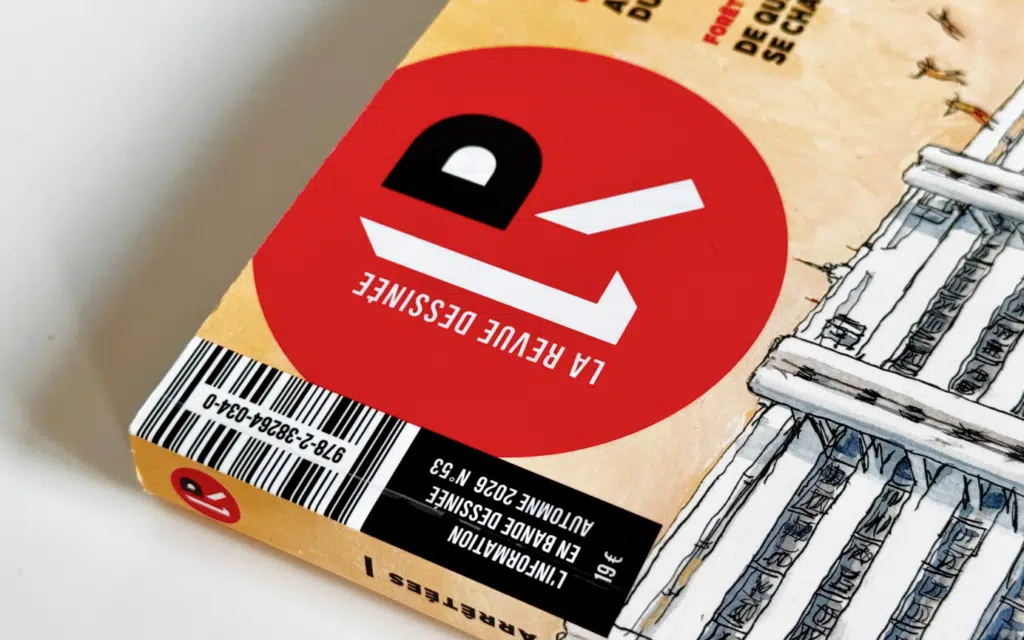
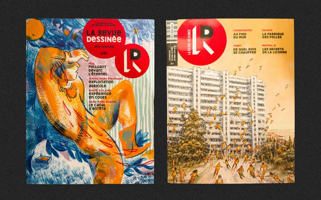
Following the same logic, to establish the brand, it’s necessary to have a strong, eye-catching typeface. In the original visual identity, the signature typeface had been custom-designed for the magazine, and to convey information through illustrations, the playful nature of this typeface was essential. However, after about fifty issues, *La Revue Dessinée* has established itself in the media landscape and no longer needs to be quite so showy.
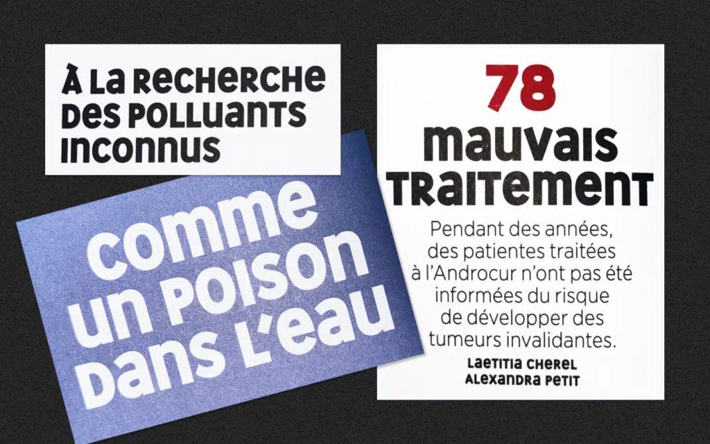
What had previously been the font’s strength has now become a hindrance: the playful mix of lowercase and uppercase letters makes the text harder to read. And since *La Revue Dessinée* is already visually rich in other ways, this typeface draws too much attention—attention that would be better directed toward the text and the illustrations. That’s why Cat chose to tone down the visual identity a bit to make more room for the text and illustrations.
“It took me a while to let go of that font, but once I tried, its absence became obvious. The hardest part was realizing it, because the whole team was so focused on the task at hand.”
The font now used for headlines is Gotham, which was previously used for body text. It was chosen for headlines because it is very geometric, bold, and visually striking, while also being contemporary and popular. It’s also a font we’ve come to expect to see in independent media. Another advantage is its great flexibility, with various character weights available, as well as the ability to condense them. In graphic design, it’s very useful to have such a flexible font because it allows you to create hierarchies and emphasize certain words more strongly, even at the last minute.
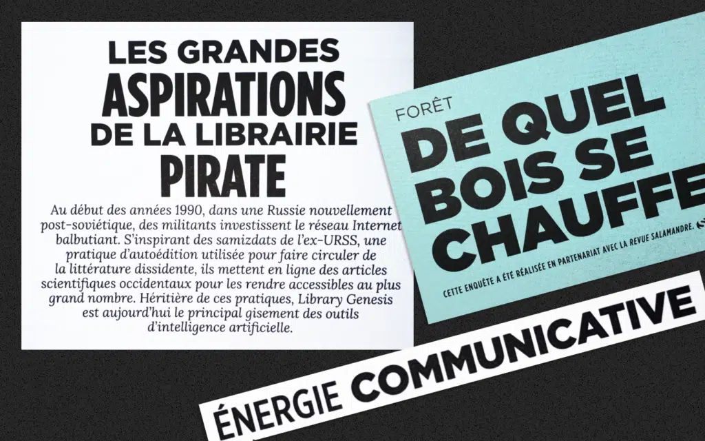
Test ideas using real content
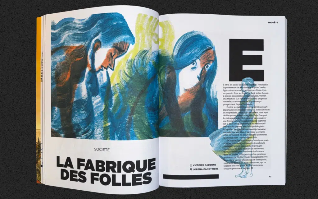
Shifting the magazine’s visual focus slightly more toward journalism should not come at the expense of illustrations: balance is essential. Numerous tests were conducted on double-page spreads to find the right balance between images and text and to verify feasibility using actual content, in order to avoid creating a layout that looks great but is discontinued after just two issues because it’s too complex to use.
“Many times, it didn’t work. Sometimes, to achieve something simple, you have to think long and hard. In industrial design, we know that all too well.”
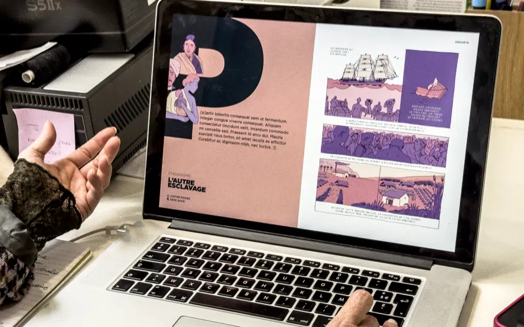
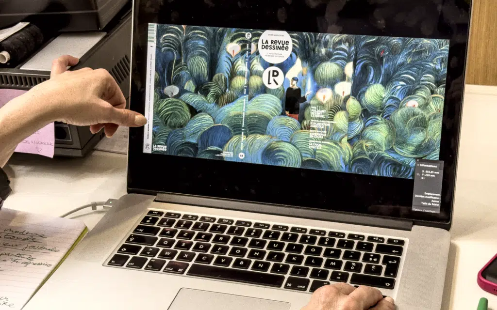
In this new layout, the text can be used to lead the reader more directly into the article by highlighting the running headline, the title, the lead paragraph, and the authors, as is common in article layout.
Depending on the situation, adjustments are made to better highlight the journalistic aspect, while visually framing it to achieve a better balance between information and visuals.
Allowing space for self-expression and freedom
In a newsroom, two worlds often clash: on one hand, the creativity of graphic designers and illustrators; on the other, the seriousness of journalists and the editorial staff, who are accustomed to the rigor of transcribing and verifying information. For example, if you tell an editor-in-chief that there is a style guide, they will never allow themselves to deviate from the rules.
The role of artistic direction is also to clarify which fundamentals remain unchanged and where we can push the boundaries to allow for sufficient adaptation to the reality of the subjects or the social context. This prevents us from falling back too quickly into the same problem: feeling trapped in a layout that’s too rigid.
Cat therefore proposed a clear and solid basic structure to make the texts easy to read and the sections easy to digest, while taking care to create a more dynamic layout with greater freedom where appropriate, without confusing the audience.
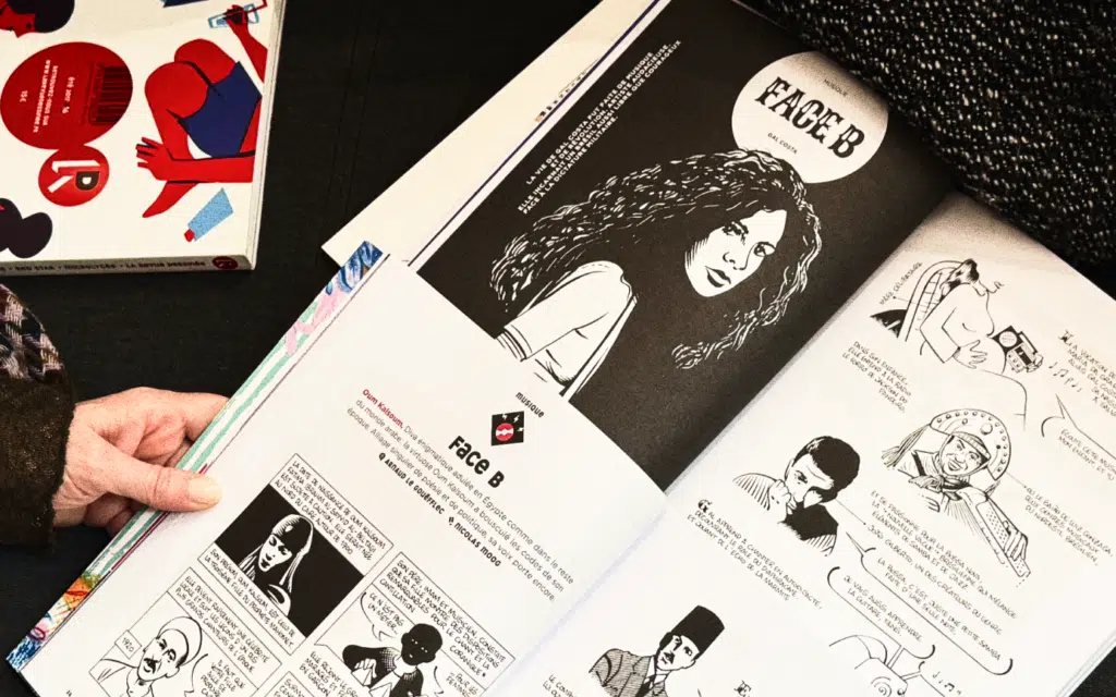
Here’s an example to illustrate this: *La Revue Dessinée* features recurring columns. From now on, each one will have its own distinct visual identity, which helps create a connection between the different issues. Cat suggested starting the “Face B” column by featuring a portrait of the person being profiled, whereas previously it appeared in small print at the end. This portrait is accompanied not by the usual font, but by custom lettering for the column’s name, “Face B.” This lettering wasn’t used for the name of the person being featured here, as it would have been too time-consuming to hand-draw new letters for each issue.
Finding Inspiration Elsewhere
The team at *La Revue Dessinée* took advantage of this redesign to revamp its subscription form. While subscriptions signed up through this form are rare, it’s essential to always offer the option—especially when the magazine publishes investigations into digital discrimination. That said, there’s no reason not to streamline costs a bit: the form is now designed to cover several issues instead of just one, which allows for a small economy of scale.
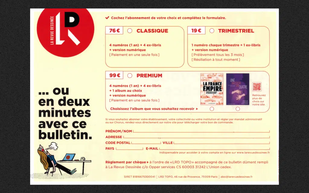
Recognizing that people who want to subscribe via paper will stick with paper all the way through and pay by check, the decision was made to remove the IBAN and credit card payment options from the form. This frees up more space for the offers, making them clearer. Cat told me she drew a lot of inspiration from Spotify here, since they’re very good at visually conveying the sense that everything will be very simple. It’s true that it’s often helpful to seek inspiration from other industries and not limit oneself solely to the media sector.
In this redesign, the work mainly involved deciding what to keep, what to tone down, what to strengthen, and what to change: it’s an exercise in sorting and taking stock before it’s an exercise in style—and above all, it’s an opportunity to realign what we show with who we are.
Did this article catch your interest, and are you looking for guidance on this topic? Médianesis also a studio where we help editorial teams navigate the challenges of realigning and strengthening their visual identity. Drop us a line!