La Croix is a French daily newspaper founded in 1883 and published by the Bayard Group. As a long-standing general-interest media outlet, it combines news coverage, in-depth analysis, and humanistic perspectives. In addition to its print edition, La Croix reaches its audience through multiple channels: its website, newsletters, and social media.
What should be done when a policy exists, but everyone interprets and applies it in their own way?
The context
In November 2025, La Croix turned to us. La Croix already had graphic design guidelines. The problem wasn’t their absence, but how they were applied: between print and digital, and among the teams responsible for subscriptions, donations, marketing, product development, and communications, interpretations varied widely. This fragmentation weakened the impact on the readership and complicated internal work. Our mission: to clarify and harmonize without reinventing everything.
What is the impact?
The style guide is no longer just a document to consult—it’s a tool to use: the rules are built right into the working files, templates, and the Figma library.
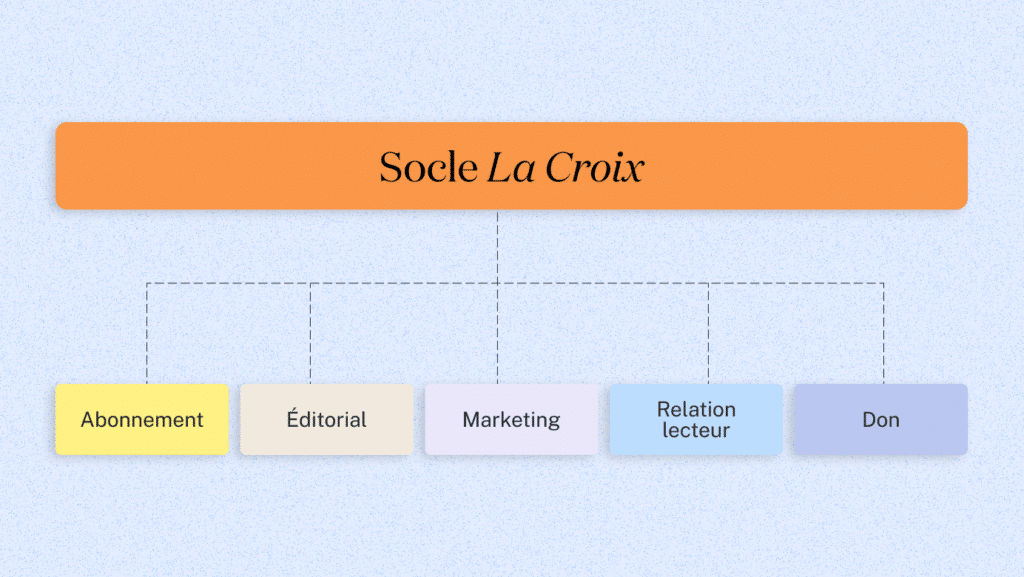
We streamlined and standardized the color palette, which previously included more than sixty shades. We proposed a unified family of pictograms to replace the dozens of disparate pictograms in use. We also streamlined the use of brand blocks, which were numerous and served different purposes. Teams now have explicit guidelines: a common foundation and five dedicated sub-guidelines (editorial, marketing, subscriptions, reader relations, and donations). The templates and shared Figma library provide everyone with practical tools. With fewer back-and-forth exchanges and less case-by-case decision-making, teams can produce content more easily, and each medium is immediately recognizable to readers.
Building a Shared Foundation and Context-Specific Variations
Understanding the Sources of Friction
A questionnaire, two workshops, and an audit of work files, practices, and published materials revealed the key issues: incomplete briefs; work files scattered across different locations; and too much leeway in the interpretation of typography and colors. Each team had developed its own practices due to the lack of a common framework. This overburdened the teams, as coming up with new types of visuals takes time.
The various content sources for La Croix (which share journalistic content, commercial offers, appeals for donations, event invitations, etc.) were no longer identifiable.
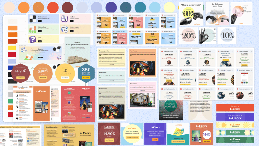
An Overview of the Rich Variety of Colors in Content
Simplify and Enhance the Design
What is the true foundation of La Croix’s visual identity? Building on what already existed (the website’s design system, the print newspaper and magazine, communication visuals, etc.), we clarified the essential components: typefaces, color palette, and iconography. The goal was not to add new rules or reinvent everything from scratch, but to save the teams time while increasing their impact. To achieve this, we had to reorganize the existing elements by examining the practical purpose of each one, transforming abstract rules into usable tools.
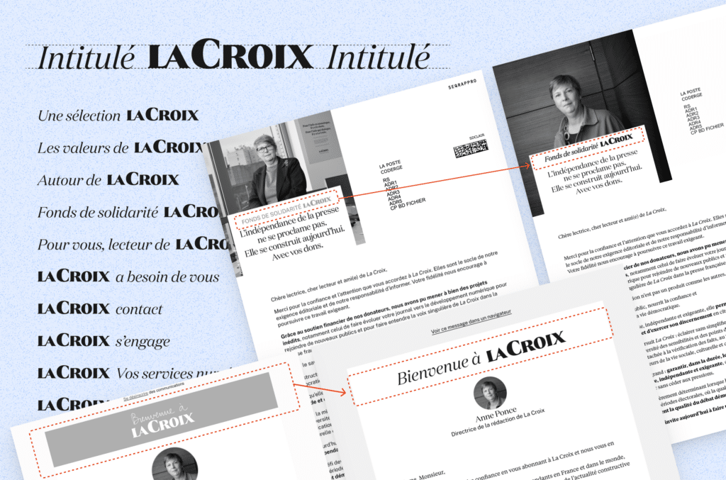
Groups featuring the La Croix logo that provide additional editorial information—without being a slogan, format, or offer—are arranged in a single line and are no longer a brand block.
Defending the media's interests
In addition to the common style guide, we have created five sub-guides for specific communication contexts: editorial, marketing, subscriptions, reader relations, and donations. Each has its own set of rules (additional colors, specific layouts, distinctive imagery) to distinguish between different communication channels within La Croix while maintaining a high degree of consistency.
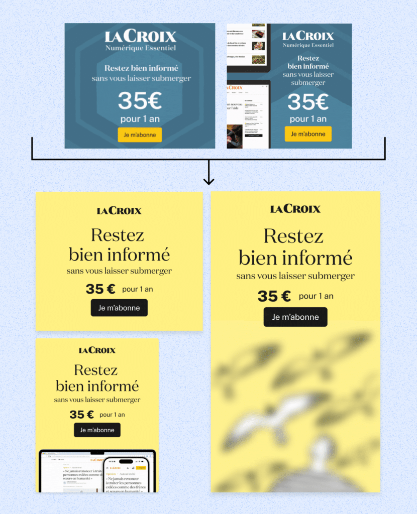
For example, anything related to subscriptions is now always highlighted in yellow. We also gave careful thought to user flows and the hierarchy of information in order to offer different settings that highlight what seems most important for convincing users. Here, marketing concepts were at the heart of the matter.
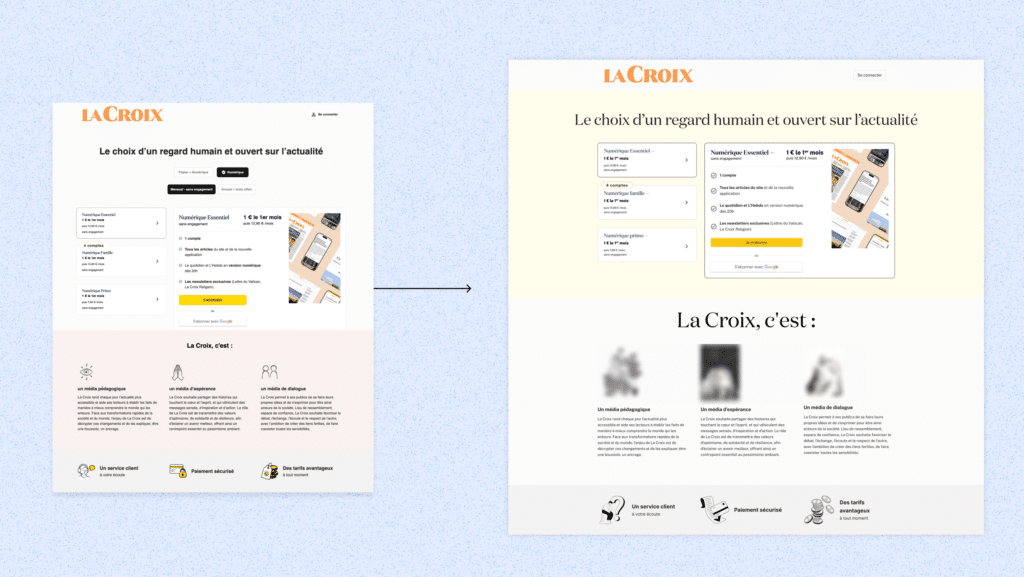
The subscription page and our recommendation on the right, showing the new guidelines for fonts, illustrations (blurred here), and pictograms. The information hierarchy has also been revised.
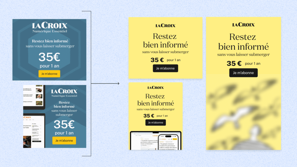
A subscription ad and our recommendation on the right, featuring the new guidelines for typography, product visuals, and an illustration (blurred here). The slogan is more important than the price here.
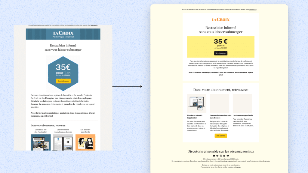
An email campaign featuring a subscription offer and our recommendation on the right, along with the new guidelines for fonts, illustrations (blurred here), and product images. We also proposed a new structure to clarify the message.
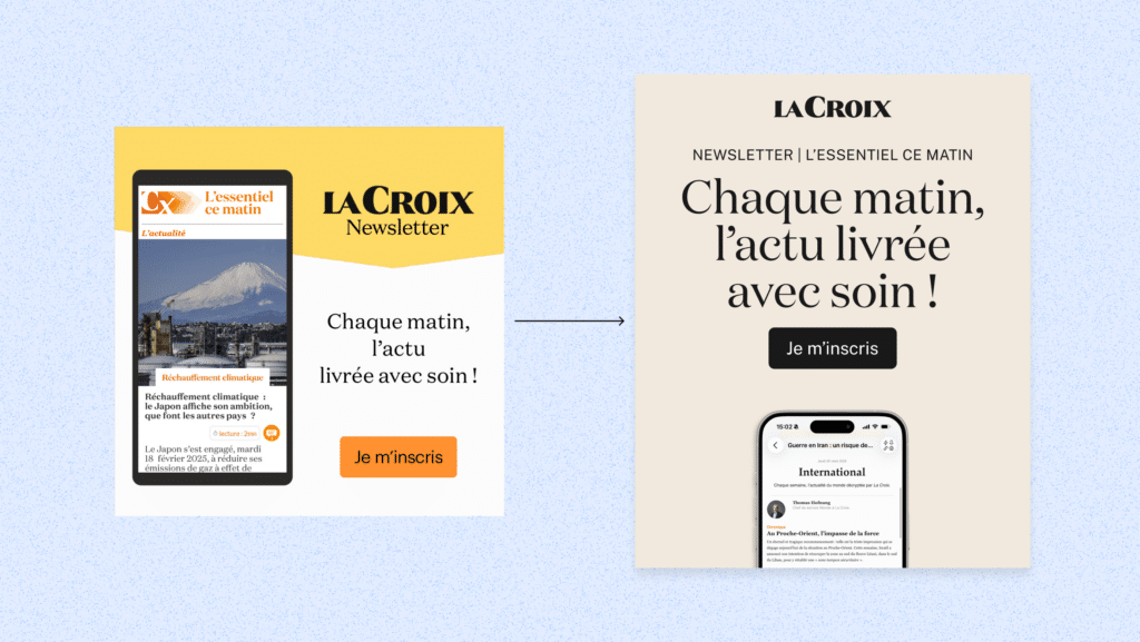
A suggestion to simplify a newsletter insert by including a partial preview of the newsletter at the bottom and highlighting the value proposition. The color yellow, which was previously reserved for the subscription section, no longer appears in the editorial style guide.
Confirm at each step
The harmonization process involved three rounds of back-and-forth discussions on the key principles. We first applied them to certain priority formats, then prototyped the most important new templates based on the finalized rules. Quick review sessions were held at each key stage to validate or refine the principles and speed up decision-making.
Deliver and provide guidance on getting started
Organize, document, and present new products
We presented the guiding principles of the framework and sub-guidelines to the teams, answered their questions, and then remained available to address any concerns they might have about implementing these new practices.
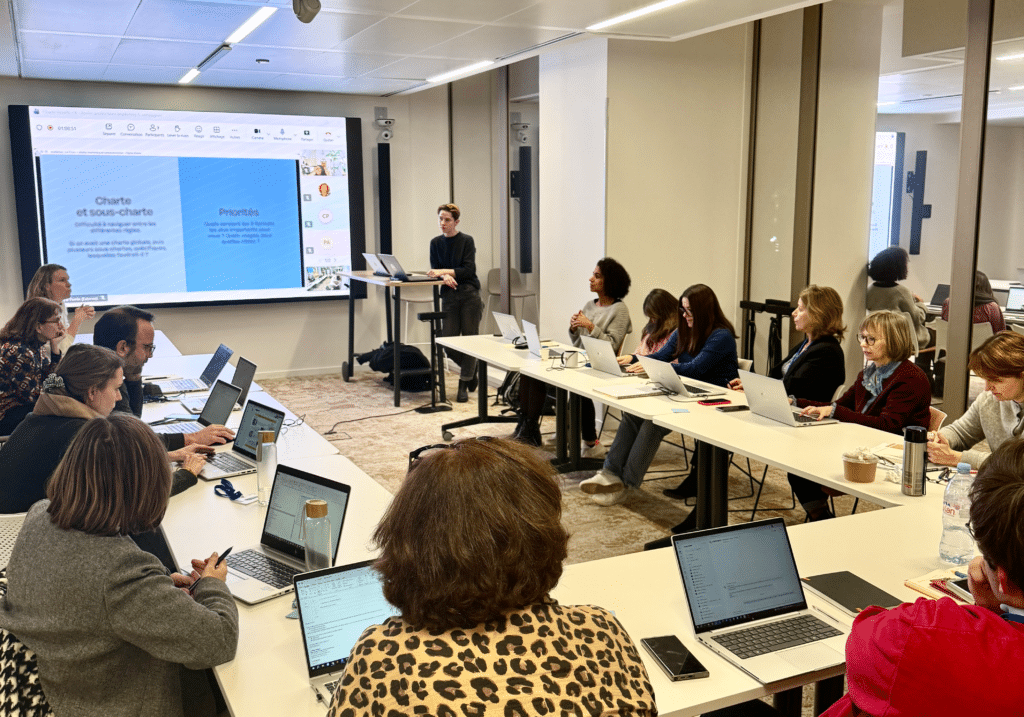
Workshop on the relationship between the core charter and the sub-charters.
Once the principles were approved, and to ensure these rules would actually be usable, we embedded them directly into the files by tagging them. We then developed templates and concrete examples of page layouts. This toolkit covered a wide range of media and formats: letterheads and brand blocks, physical mail, email campaigns, social media (posts and stories), slides, registration forms, web banners, pop-ups, paywalls, and more. Everything was created in Figma or Adobe InDesign, depending on the nature of the final medium.
Specific guidelines were provided regarding content settings—size, weight, line spacing, color, etc.—so that the La Croix team could save them in a shared Figma library. This library also contains logos, a unique set of pictograms, approved illustrations, standards for shading and outlines, and a limited color palette tailored to specific uses. We delivered the source Figma and InDesign files to help the teams get up to speed.
This mission was coordinated by Christelle Perrin, with assistance from Marine Doux and Noé Mellier.