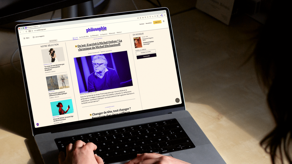
Founded in 2006, *Philosophie magazine* is an independent media outlet that examines current events and the world through the lens of philosophy—in print and online, in its newsletters, and at public events. For the magazine, philosophy is a method of analysis, not an academic subject.
In the spring of 2026, *Philosophie magazine* is set to celebrate its 20th anniversary and publish its 200th issue. The team wants to use this opportunity to modernize its digital presence and attract a new readership, particularly 18- to 34-year-olds. As the cornerstone of this growth strategy, the website must become more modern and efficient.
The consensus is clear: while the magazine is polished and effective, the website appears more bland, cluttered, and less user-friendly. It lacks clear design guidelines, the menu is overloaded, and the premium offering isn’t prominently featured. There are many needs, but the timeline—aligned with the anniversary—requires us to make choices. Management has asked us to prioritize these needs and then carry out a targeted redesign: a website that is more premium, more youthful, and more readable, while remaining true to the editorial positioning.
Our proposals must be feasible given the technical constraints of their current website, so we take these specific characteristics into account to suggest solutions that can be easily integrated without needing to alter the website's structure.
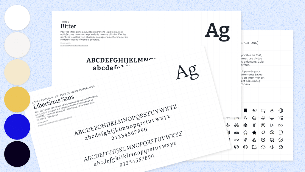
Overview of the new colors, fonts, and icons, and an overview of the settings for the product page.
What is the impact?
In just a few weeks, *Philosophie magazine* now has an updated visual identity guide (colors, typefaces, premium branding, icon library, etc.) that outlines the rules for use (logo, typefaces, colors, iconography) along with web-specific adaptations, such as call-to-action buttons, hover effects, and CSS style sheets. We’ve also included guidelines on iconography.
These changes were incorporated into our work on the website’s user experience. We created the design and web mockups, which are ready for implementation. In particular, we simplified the UX/UI navigation (header, menu, sections) and redesigned the main pages: the homepage, the store, the subscription page, the newsletter sign-up page, the article page, the paywalls, and the marketing inserts.
Modernizing and Optimizing the Digital World
Prioritize construction projects
After reviewing the documents provided by management (studies, marketing presentations, graphic elements), we led a half-day workshop with the project team to refine the brief. The goal was to distinguish between what was essential and what was secondary. A few days later, we delivered a concise set of specifications to translate the requirements into a feasible roadmap that could be completed on time.
Establishing a Visual Identity
We’re realigning the site’s artistic direction around three criteria: more magazine-like, more premium, and more youthful. Colors, typefaces, pictograms, and iconography—every element is being redesigned to improve clarity. We’re presenting these choices directly in the site’s page mockups to bring them to life. Blue is reaffirmed as the signature color; dot icons make the paid content easily identifiable; and the mockups are shared, along with a guide, to simplify implementation. Throughout the project, we keep technical feasibility at the forefront of our minds.
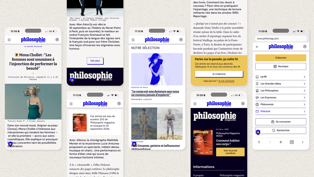
Streamline the processes
We’re focusing our efforts on pages with high conversion potential: navigation, the homepage, newsletter sign-up, the subscription page, the Issue 200 landing page, paywalls, and marketing inserts. The goal: to reduce friction between reading an article and subscribing.
Train and support the team
Once the assets were delivered, we trained the team on how to use them in Figma so they could update the web visuals and create new ones on their own.
— This entire project was led by Christelle Perrin, coordinated by Julia Lasry, and supervised by Marine Doux.