Graphs, infographics, maps: whether to present the news in a different way or to make sense of raw data, data visualization is everywhere. It’s certainly appealing, but it can seem technically and financially costly. However, there are many free resources and tools available to help you get started and find inspiration.
Resources you’ll use: It all
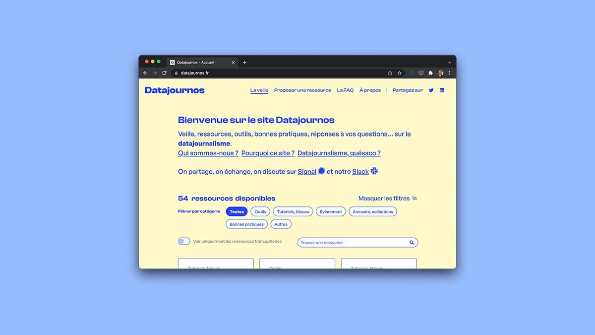
started with a conversation among data journalists and an observation: the use of data visualization is on the rise in newsrooms and journalism schools. But it’s not always easy to get started without specific training. Datajournos was launched by Victor Alexandre, Karen Bastien, Yann Guégan, and Alexandre Léchénet to meet this need. In addition to the resources on the site, there are also forums for discussion. A gold mine.
Tools: Graphic designer Clara Dealberto shares
information on Twitter about the tools she uses to present data in the form of graphics (Flourish, Rawgraphs) or maps (Khartis). She also shares the method she uses to conceive and create her data visualizations. Simple, free tips. Need some inspiration? Datavizcatalogue can help you choose the most relevant template.
You’ll find inspiration in these examples:
The WeDoData studio, which specializes in data visualization, works with numerous media outlets and publishes all of its work. It’s a great way to find inspiration! For its part, Heidi.news has chosen to address climate change through various types of visualizations. If you’re more into Instagram and socially conscious film, we’ve got a graphic favorite: *21st Century Women*. In video format, Vox tackles police violence through illustrated graphics, and we highly recommend the must-see Datagueule. Shall we get started?