How do you give a distinctive voice to a transnational network?
The context
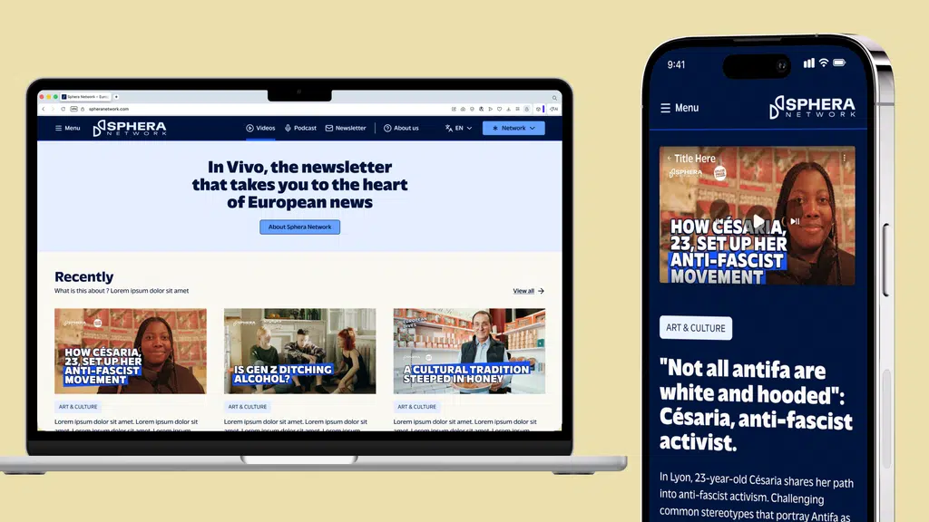
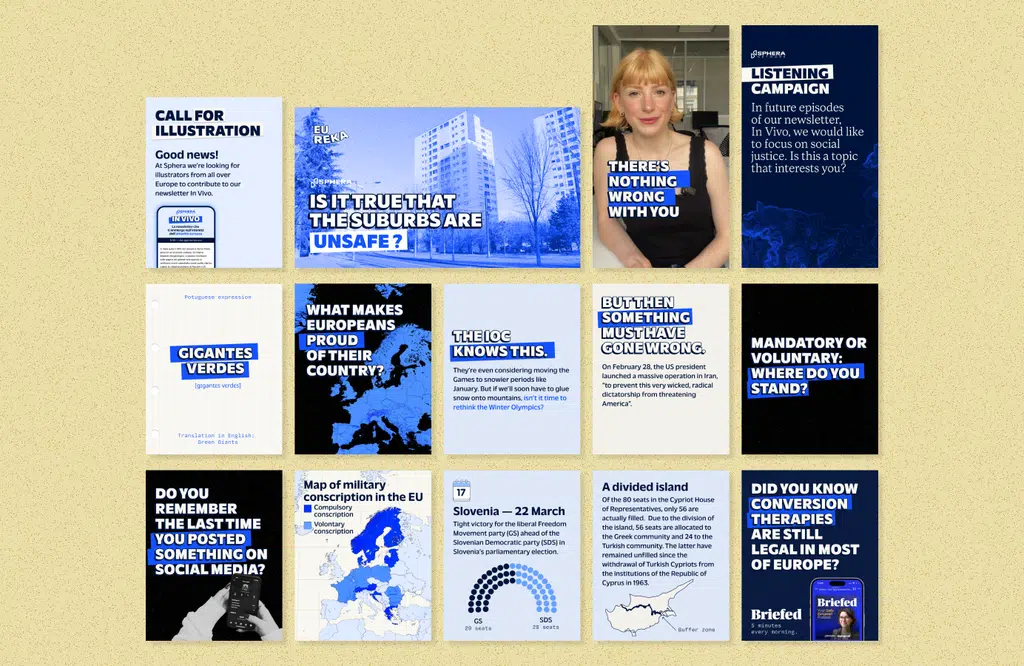
Once the Sphera project was stabilized under Médianes's coordination, we identified a need: to clearly show this coming together and update Sphera's identity. The goal was twofold: to make it more visually dynamic, but also easier and faster to use for the team, by making usage more flexible and simplified.
Build a coherent and flexible visual identity
Find the right artistic direction
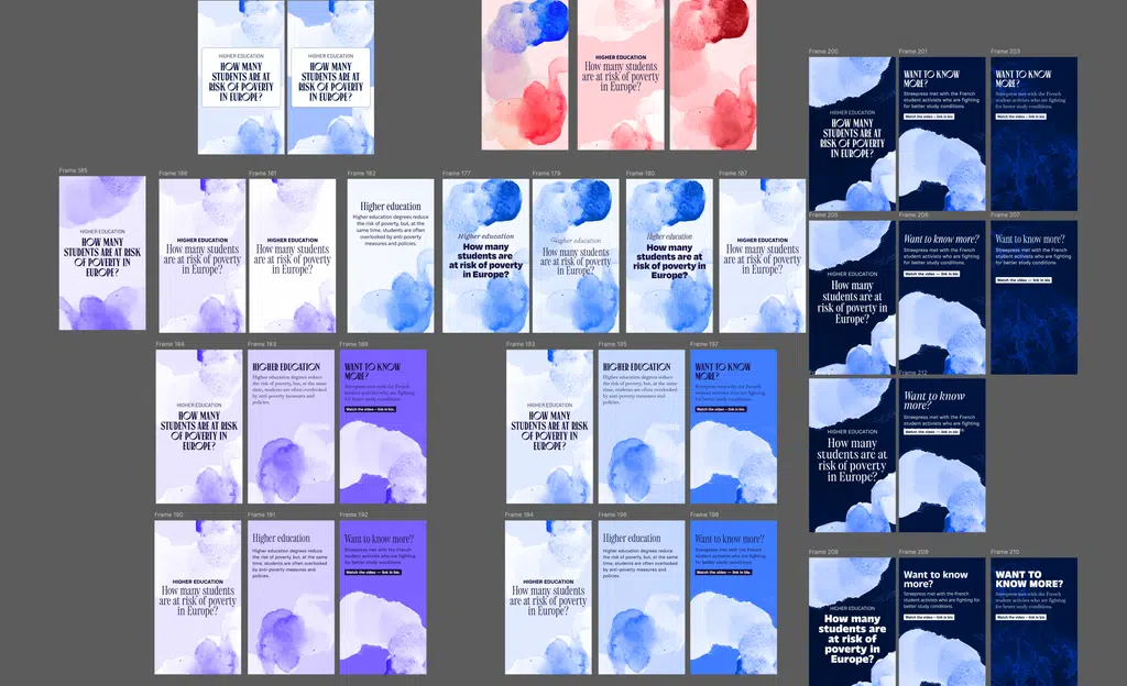
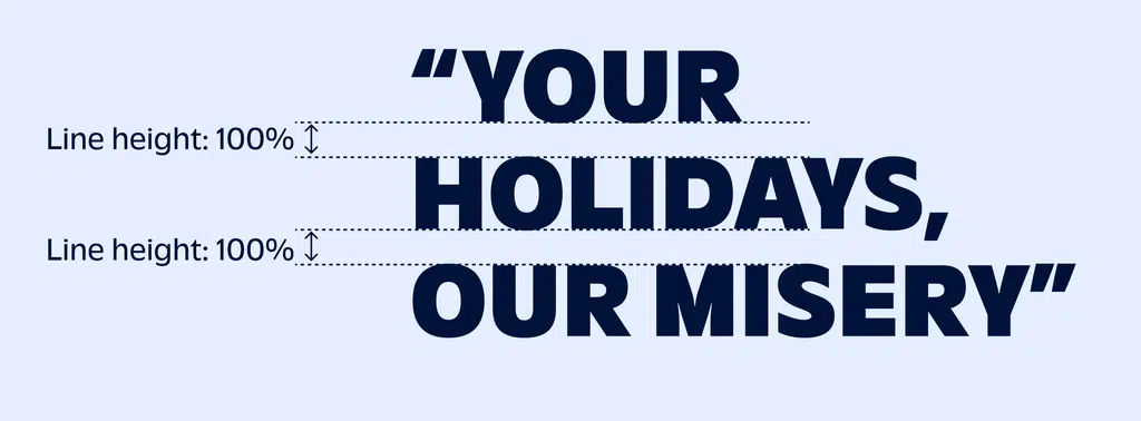
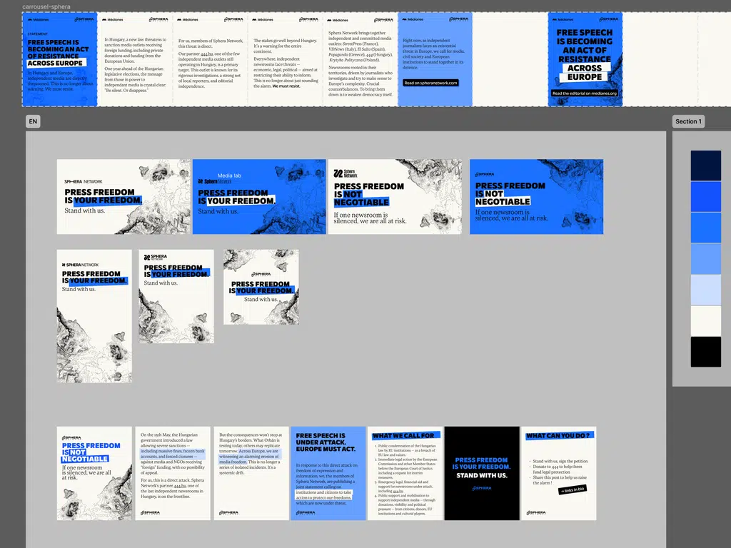
Before settling on a direction, we explored several approaches: color tests, font trials, mood variations. Before finding the right balance and orientation, we ran multiple tests in different directions, working directly with content produced by the editorial team to save time.
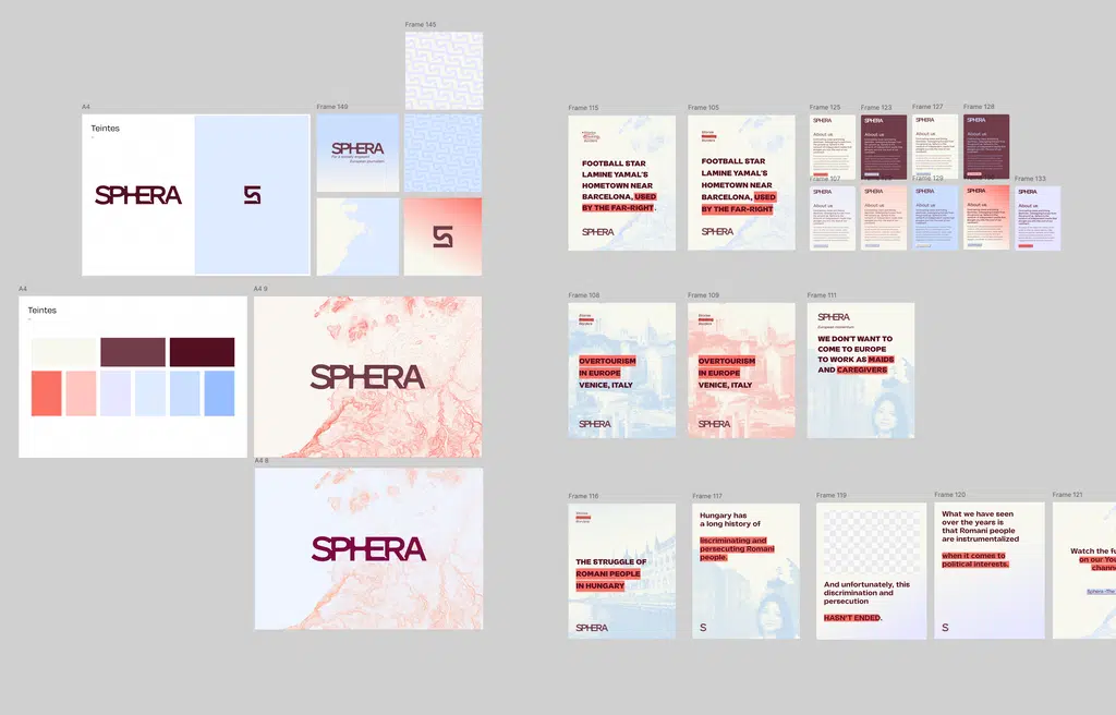
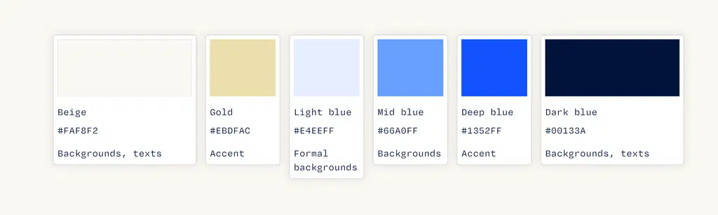
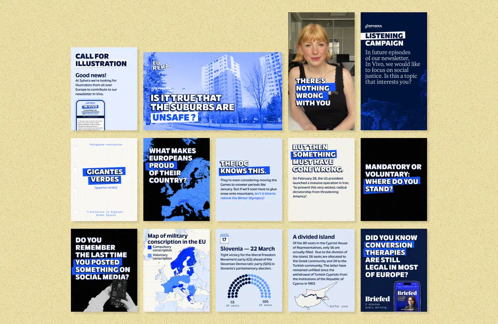
We gradually stabilized a palette: blue, beige and very dark blue as a foundation, enriched with warmer colors to create contrast. The addition of textural grain completes the mood, softer and more thoughtful than what came before, without sacrificing dynamism.
Strengthen the newsletter through illustration
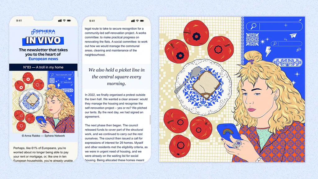
To improve readability and align the newsletter with Sphera's new visual identity, we redesigned the newsletter layout. Translated into three languages and centered on the testimony of a European, it provides an immersive experience into this person's lived experience. To strengthen this, we decided to enhance the newsletter with original illustrations. Following a call for applications, we selected three young European illustrators to vary the styles.
Create a distinctive sonic identity
To support the move upmarket sonically and create a more professional setting, we worked with composer Nicolas Peiron on an original sonic identity. The theme exists in two variants; one calm and contemplative, the other more dynamic. They are available as a short jingle and as a sound bed to accompany longer videos.
Redesign the website
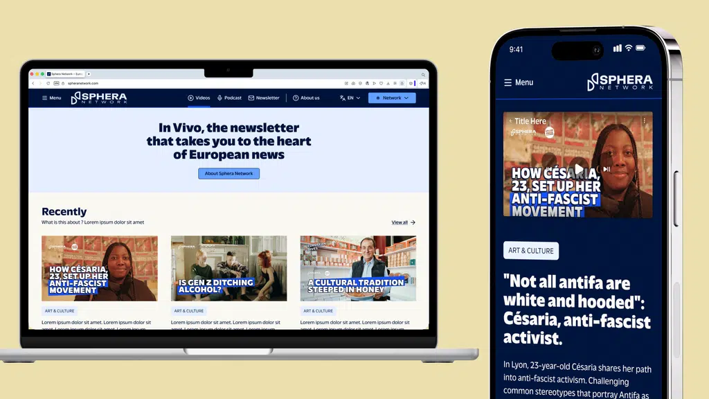
Once the artistic direction was established, we created new web layouts by rethinking journeys around editorial offerings and improving video viewing spaces. Integration and migration of existing content took place in-house over a few weeks for rapid deployment.
What is the impact?
The new identity transformed Sphera's online presence: more recognizable, more engaging, more operational for teams. The color palette (blue, beige and dark blue enriched with warm colors) creates clear contrasts. The redesigned newsletter, with its original illustrations and new layout, offers better immersion in European testimonies. The sonic identity brings new professional quality to video content. The restructured website now places editorial offerings at the heart of the experience.
This entire mission was led by Christelle Perrin, with Elia Faverie and Noé Mellier.