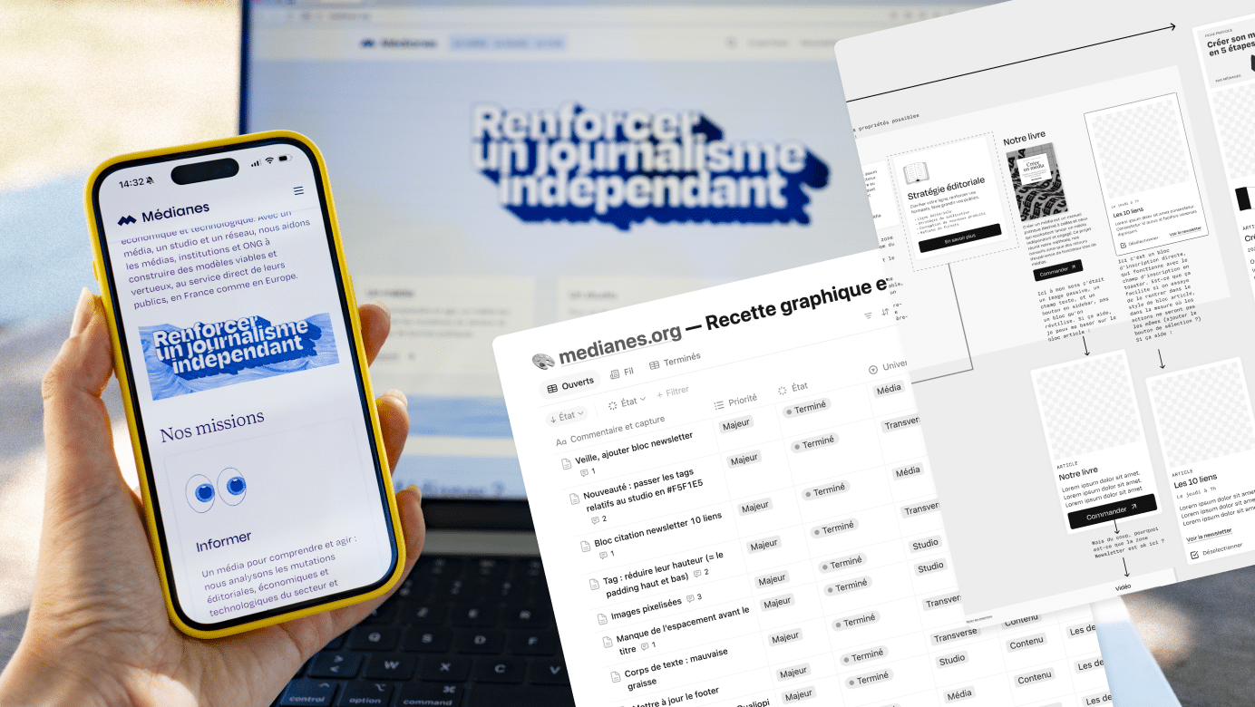
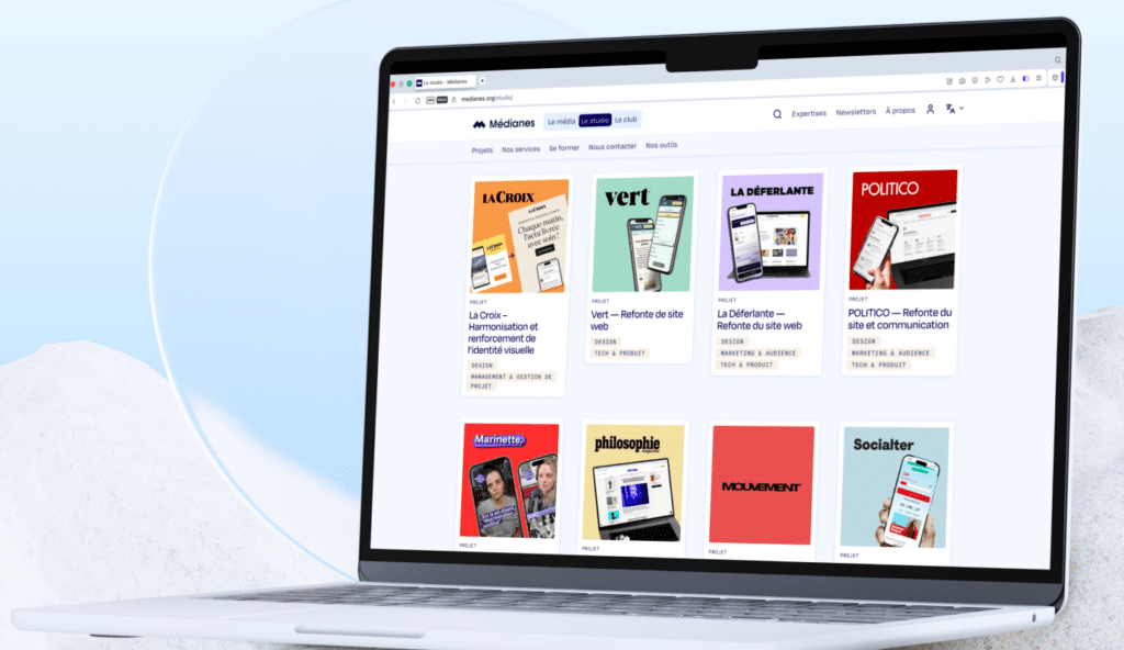
Since 2020, through our studio, we’ve been helping media outlets strengthen their value proposition, create clear user journeys for their audiences, maintain control over their tools… and redesign their websites. We’ve created or redesigned the websites of dozens of media outlets, including POLITICO, Vert, 60 Millions de consommateurs, Le Cri, Tenoua, Philosophie Magazine, Pays, and many others. As for our own website, it was patiently waiting for its turn.
Why Now?
We are delighted to have brought our media outlet, our studio, and our network together under one roof to increase our impact and make our offerings—which have changed significantly over the past five years—more accessible to media executives, journalists, and creators in France and across Europe.
We have indeed become more European by coordinating our network of independent media outlets, Sphera, over the past two years. Our perspective on both practices and usage has become sharper, and we have published more content in various formats (text, audio, video). The team has grown and become more structured: while there were five of us in 2021, there are nearly 20 of us today. And, so to speak, two pillars have been strengthened. On the one hand, there’s the hands-on work alongside the media outlets we support (management, marketing, design, tech, admin, etc.) and the tools we’re developing to pool our efforts—notably with Socle. On the other hand, there’s our journalistic and forward-looking analysis of their independence.
In practical terms, we needed to help every visitor quickly understand where they are, what they’re doing, andMédianes what they canMédianes do for their media outlet. We built our new website using the method we already apply at the organizations we support (we’ll tell you more about that below!) and drawing on the insights and ideas we develop every day.
What's New
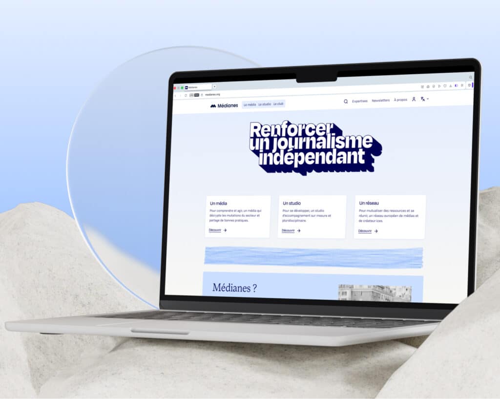
- A single entry point: Media, Studio, and Network are now all in one place, and the homepage directs each user to the section that applies to them. The main homepage provides an overview of the three pillars, while each section then has its own portal.
- Technical choices focused on open-source tools: The site puts into practice what we advocate regarding digital independence. We developed new features ourselves so that we would no longer have to rely on plug-ins or opaque proprietary services. For the CMS, we chose WordPress, which is open source and consistent with our recommendations.
- Paths by Profile: A media outlet seeking guidance, a journalist covering issues of independence, a European partner looking for information—everyone now has their own path.
- Bridges between media, studios, and networks: Making it easier to discover other topics or areas of expertiseMédianes, without causing confusion.
- An Index: Here, we provide a comprehensive list of all the projects the studio has completedMédianes, including those not presented as individual projects, to ensure greater transparency and provide inspiration to our readers.
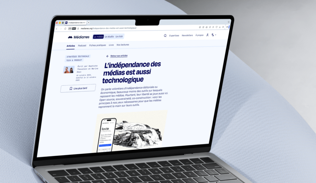
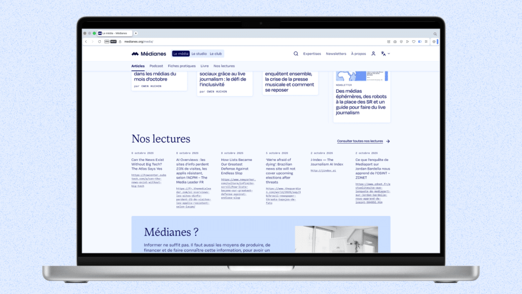
- A redesigned article page: More readable and user-friendly, it links to a resource, related expertise, and the newsletter.
- Improved navigation through projects: Navigation by category and square images (when editorial images are in landscape format) to better identify the media outlets featured and provide an initial understanding of the type of project carried out.
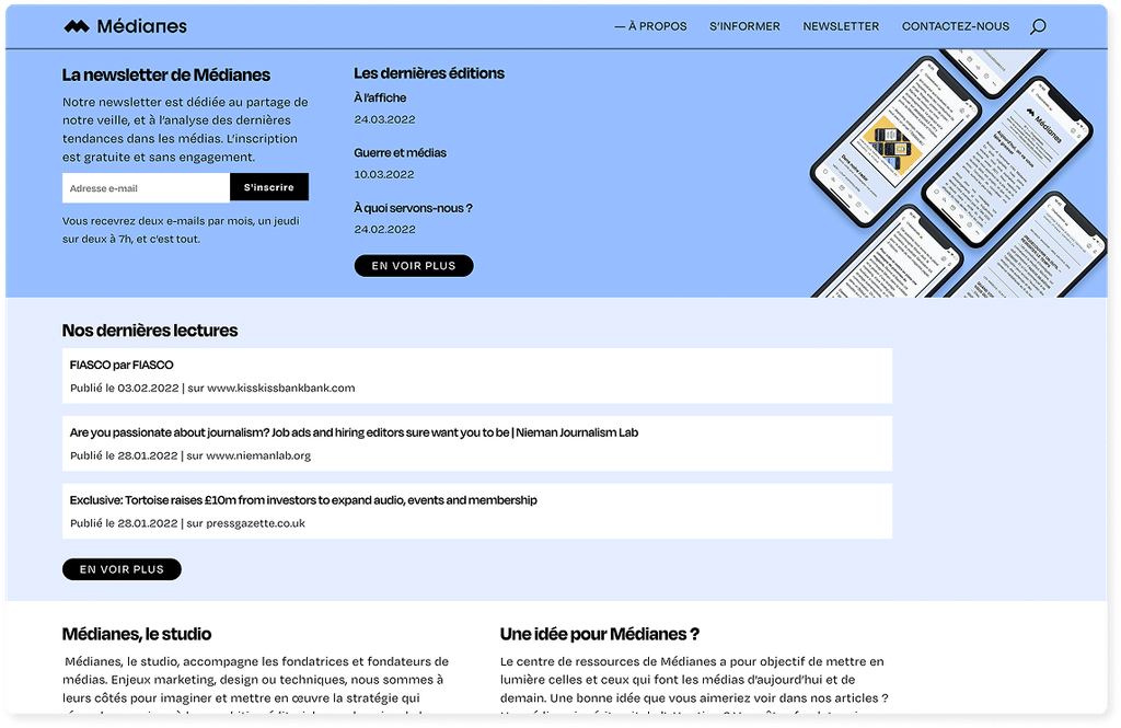
- Sharing Our Monitoring Findings: A “What We’re Reading” section that allows us to publicly share the information we find most relevant, directly on our website. We tried to implement this feature in 2022, but it wasn’t very user-friendly; now it’s finally back.
The Starting Point
Until now, we’dMédianes been operating on two separate sites since 2021 (you know the saying, “the cobbler’s children have no shoes”? We know it all too well). On one hand, medianes.org hosted our editorial content: articles, newsletters, how-to guides, and case studies. On the other, medianes.studio showcased the studio’s work: client case studies, projects, and training programs. Each site had its own back-end, its own navigation structure, and its own way of presenting our work. In the meantime, we created or redesigned other, lighter-weight sites like programme.medianes.org to highlight our various activities as a media outlet, consulting studio, European network, and support program—and even used the personal portfolio of Christelle Perrin, our design director, to showcase certain projects. These piecemeal efforts scattered the project across too many places. For new visitorsMédianes, this fragmentation muddled the message. For our team, it doubled the workload for publishing and maintenance.
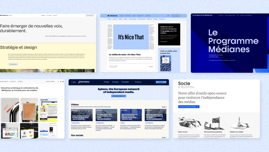
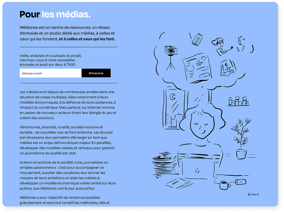
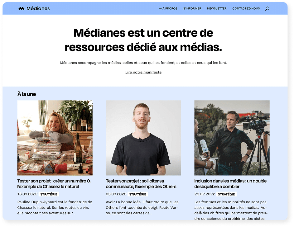
Why did we have two websites at first?
When we launched inMédianes 2020, we had two projects in mind: a for-profit venture—the consulting studio—and a nonprofit initiative—the media outlet and mutual aid network. Being crazy about administrative details, we set up two legal entities: an SAS and a nonprofit association. At the time, it seemed logical to us to separate the studio’s website (medianes.studio) from the media platform (medianes.org). We thought our two activities weren’t aimed at the same audiences, and we didn’t yet know that the studio would become a pillar of Médianes. We also wanted to make the media platform a fully-fledged journalistic entity and avoid giving the impression that it was just the studio’s blog. For several years now, this separation has been working against us by complicating navigation and usage… and we’ve come to understand that independence isn’t about having two separate websites, but rather about our editorial and economic model, and our ethical principles.
Our method, as applied to ourselves
We mentioned earlier the saying about the cobbler’s children having no shoes: let’s be honest, this project was slow to get off the ground. While we’re capable of delivering flawless website redesigns for our valued clients in 3 to 6 months—as we did with Vert, POLITICO, or currently with Socialter, we must admit that we often put the redesign of our own site on hold to focus on client projects, media challenges, or internal restructuring—such as the integration of the Sphera team and partners in 2025. The website redesign became a priority again in the spring of 2026, after we had redefined our value proposition and vision. At that point, a clear organizational structure was put in place, and we took advantage of the summer to have everyone contribute to this project.
We had to start by focusing on the team’s needs and our goals. Since our first mockups, which dated back to 2024, a lot had changed: so we checked, division by division (media, studio, network), to ensure the site remained aligned with our target audiences and with everyone’s usage patterns, right down to the back office. And since 2024, it wasn’t just our needs that had changed, but also our tools: the introduction of Claude Code also allowed us to develop this website more quickly.
After this initial internal brainstorming session, we were able to discuss it with Maxime Loisel, an independent UX consultant and collaborator at [company name]Médianes, and then with our friends at Studio 9P, to benefit from expert, outside perspectives (and because it’s hard to take a step back and look at your own work objectively).
The project itself was carried out entirely in-house, guided by a product-centric approach to make decisions and a RACI matrix to determine who makes decisions: marketing perspective and priorities, graphic design and user journey, development and testing, and content creation. We brought together experts from every field—including training and editorial—to adapt the mockups to the team’s current needs (including the back office!) while staying aligned with our target audiences. We then moved forward in sprints thanks to the meticulous project leadership of Dorine Planté, our support manager. It was a real pleasure to join forces in this final stretch and put into practice the methods we apply to others.
Behind the Scenes
Leading a cross-functional project with the entire team, alongside client assignments, is first and foremost a management challenge: carving out time, clarifying each person’s role, making quick decisions, and maintaining momentum over the long term. Dorine Planté played a central role in project management here.
Dorine’s fresh perspective, combined with that of Charlène Hourdin, Nicolas Troadec, and Noé Mellier on the web side, was invaluable in raising questions about the mockups that Christelle Perrin and Baptiste Thevelein had created the previous year.
Together, we developed an action plan and a to-do list with tickets assigned to each request. We also implemented a comprehensive testing phase and a process for the entire team to report questions and issues. It was this crystal-clear organization that united the team around a common goal and helped maintain a cheerful work atmosphere. We are now convinced that for any internal project—especially cross-functional ones—even when it seems like it will be quick, we need clear organization and project leadership.
Design: Adapting the Art Direction to the Web and the Need for a Handcrafted Look
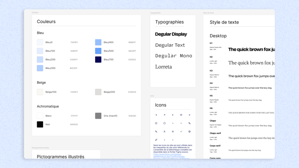
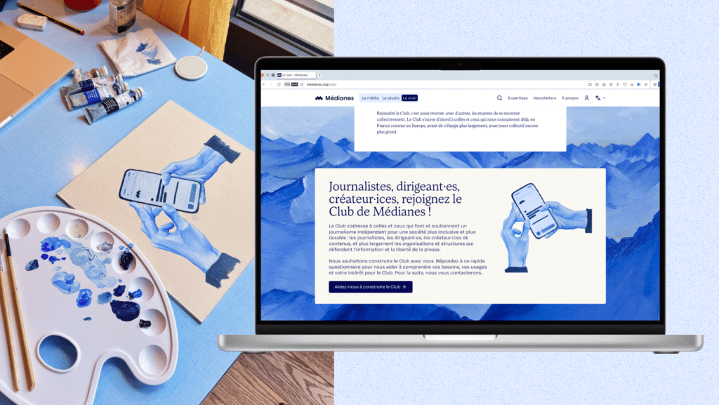
Designed in-house by Christelle Perrin, our design director, with support from Baptiste Thevelein, our technical director, the mockups emphasize readability. We wanted a visually light design that could serve as a showcase for both the media’s ideas and the studio’s completed projects. We used light shades drawn from the overall artistic direction:Médianes blues for the media, paired with beiges for the studio, to create a very subtle distinction between these spaces.
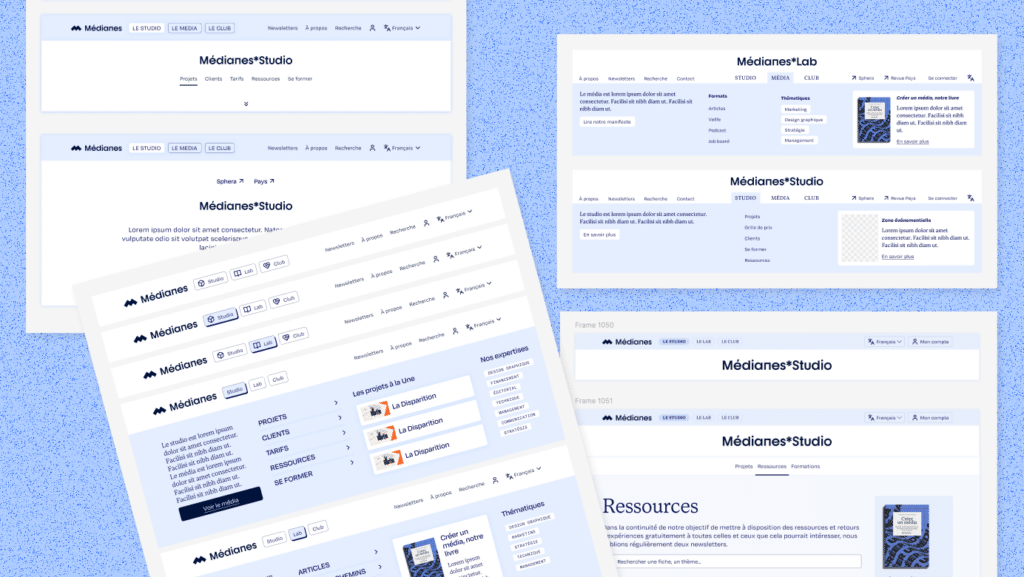
The menu structure and navigation paths have been refined to clarify the editorial and commercial offerings of [name]Médianes, and to make it easier for users to discover and move from one section to another.
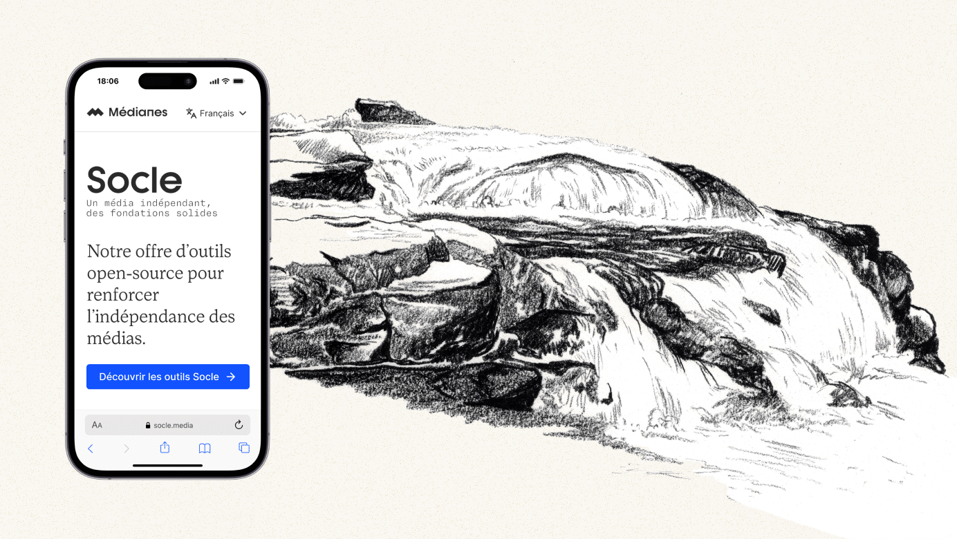
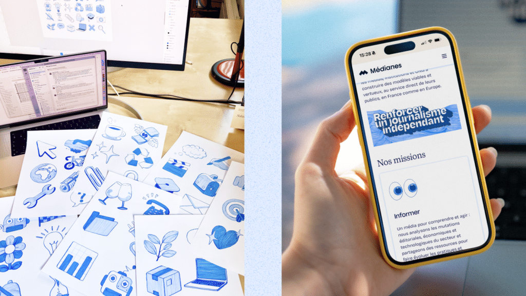
Since the first mockups, the media landscape has changed significantly with the advent of artificial intelligence and the rise of automatically generated websites and graphic design guidelines: we felt it was essential to also add some textural elements: illustrations created with felt-tip pens, oil paint, and charcoal on paper, then digitized. The idea was to restore a warmer, more human feel and to add a bit of texture to a website that is otherwise very focused on efficiency and technology.
Editorial: Keep, Rewrite, and Delete
We’ve done the very work we’re asking all media outlets to do. Above all, this involves making choices and striking a balance between editorial content, marketing, and user interface: we had lengthy discussions with the editorial team and our journalists (Owen Huchon, Agathe Kupfer, Marine Doux, Dorine Planté, Margot Darcy, Sixtine Yung, and Elise Garnier) to ensure consistency between content and form.
We also developed a categorization system to organize articles and columns on various topics so that the content is no longer presented solely in chronological order.
We have also imported all of the newsletters from sinceMédianes their launch. Until now, their content was accessible only to those who had received them; it now forms an archive open to everyone. Compiling this historical record was a major undertaking, and one of which we are particularly proud.
Technique: Combining Simplicity with Confidence
The integration was carried out in just a few months by the team at Médianes. This project also provided an opportunity to combine an eco-design approach with a commitment to performance and efficiency. We used various AI models and orchestration tools to organize and distribute the integration work, resulting in clean, reliable code in a short amount of time.
The site is built using the Gutenberg block editor with full-site editing, based on a deliberately minimalist theme that allows for the creation of any type of user experience. The two back-end systems have been consolidated into a single one, where each type of content has its own template and layout: training courses, case studies, projects, articles, and newsletters.
Rather than piling on extensions, we chose to design several essential building blocks ourselves:
- a wall restricting access to content;
- saving articles to read later;
- A space matters to readers;
- managing newsletter subscriptions;
- A registration process redesigned from the ground up.
This site also serves as a testing ground for us. Many of these building blocks are designed to be reusable and shared with the media outlets we work with.
Hosting is provided by Infomaniak, a Swiss hosting company we have been working with for several years and with whom we have a relationship built on trust.
What now?
This redesign has allowed us to clarify our identity, simplify our teams’ work, and build tools that we can share with the media outlets we support. It illustrates the way we like to work: using open source, keeping things simple, and doing what really matters ourselves.
The site is live, but development and maintenance will continue. For our customers as well as for us, we follow a minimum viable product approach to avoid postponing releases indefinitely in the hope of one day achieving perfection. We’ve now set aside time to fix unexpected bugs, add new features such as email alerts, and write the text that we didn’t have time to finalize and had to hide so as not to delay the launch.
A big thank you to the entire team that made this project happen, to the 9P agency, and to everyone who tested and proofread it along the way. And now, it’s your turn: let us know what works and what’s missing!
Do you need to redesign your website? We can help—just contact us.